


Every developer knows this about floor plans...


Last week I promised we would dive into the various elements of Design Development (DD). Let’s tackle unit floor plans and what every developer should know.
As a side note, at this point in our process, we have city approval on a specific unit count, but we want to go back and confirm that our unit mix still makes sense. We’re prohibited from adding MORE units and more square footage to the overall project, but we can reconfigure our unit mix if necessary. For example, if, after doing a quick review of the market, we decide that our unit mix contains too many two-bedrooms and not enough studios, we can merge a few of those studios to reach the ideal mix.
What circumstances might shift your mix?
Imagine a scenario where a competitor has completed a building on a bus corridor. They have an 80/20 mix of one bedroom to studios. During their lease-up phase, their studios were the first to rent. (You know this because even though you’ve already done your competitor analysis, you’re ALWAYS paying attention to what folks are up to. In fact, you toured every single layout they offered to see what you could learn :-). That particular developer tapped into an unforeseen market: at the end of that bus line sits a university, AND that particular university is struggling mightily with housing its students. Suddenly, studios with high-end amenities are at a premium, but that developer did not build enough of them. You can fill that gap.
Remember, the market is dynamic, and you’re always paying attention.
Once you are set on your unit mix, say 20% studios, 60% percent one bedroom, and 20% two bedrooms, your architect will send you a rough sketch of various layouts. Here are the four different studio layouts. Here are the six one-bedroom layouts. And here are the three two-bedroom layouts.
Far too many new developers stop there. They look at the options provided by the architects and say, “Oh, okay, here are my unit plans. Great!”
Not great. Your job as a developer is to now dive into these plans and take them from good to great.
The goal is not to waste an inch of space.
You aim to make a unit as functional as possible while remaining extremely attractive to a potential tenant.
Who's going to live here, and what do they want?
Here are the various things I consider.
Closet space: If you look at the floor plans for my buildings, I have ample closet space, typically at least one nice-sized closet that provides space for a single person to store their belongings.
Lighting: Is the lighting in the bathroom going to be bright enough for a woman to apply her makeup?
Size of bedrooms: This may seem counterintuitive, but one strategic thing we do is keep the bedrooms just large enough to accommodate a queen-sized bed and two-night tables. When potential tenants stand in a bedroom doorway, they want to understand how they’ll live in that room, so we always have model units available. It’s my experience that rooms with dead space create anxiety in prospective tenants because while they are gazing at the queen-sized bed, they’re also adding up the additional dollars they’ll have to spend to furnish all of the dead space you’ve created in that room. Does that corner sit empty, or do they go out and buy a $900 dollar lounge chair to fit in the corner? They don’t want to buy the chair.
TVs: What wall will the TV go on? (And if the TV's on a wall, where does the furniture have to go in the living room to accommodate that?)
Bathrooms: Is it a shower or a tub? We’ve learned over time that some women won't rent a unit if it doesn't have a tub, so we create a 50/50 mix of standing showers and showers with tubs.
Another consideration is access to the bathroom. I can’t tell you how often I see layouts where a bathroom opens to the kitchen (yuck), or in the case of an ensuite, the toilet (rather than the sink) is visible from the doorway and also happens to be visible from the space where the headboard for the bed would ideally go.
No one wants to see that, yet you'll miss things if you’re not experiencing your layout as a tenant would.
Front entryway closets: Front hall closets are common, but I’ve moved away from that design and now use the bench and hooks model. This approach costs slightly more but changes the tenant’s first experience as they walk into the unit. In Minnesota, tenants want a place to change out of their snowy boots once they come home. The bench and hook model also creates a greater sense of space because you’ve eliminated those closet doors.
Kitchen appliances: What's the order of the appliances? What's next to the sink? Is the dishwasher next to the sink, or is the dishwasher far away from the sink? Normally you want the dishwasher next to the sink as you’re loading dishes. Not two feet away.
Cabinets: Are they going to go all the way to the ceiling? Is there going to be a soffit? Are they going to end in dead space? I always try to use a soffit. It's a bit more expensive to run the soffit, but having super tall cabinets that hit the ceiling or too short cabinets where there's a space between them and the ceiling looks terrible.
Take a look at the layout below, and you’ll see many of my design principles in action in this one model unit. Again, I aim to use every square foot efficiently while delighting future tenants.
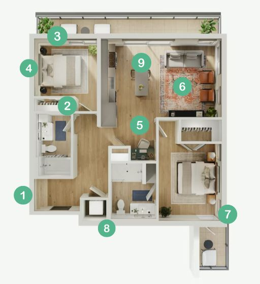
When you walk into this two-bedroom unit, there’s a hook and bench system immediately to your left. You have a place to sit and change out of your shoes. If you’re hosting a party, guests intuitively know they can hang their coats there instead of draping them over furniture. The opposing wall is a nice place to hang a favorite piece of art (which is why the bench and coat system isn’t L-shaped).
Notice that the bathroom door opens to a small opposing wall so guests in the living room do not have direct sight lines.
On the other hand, you do want direct sight lines to windows. Notice the window placement in the smaller secondary bedroom. Once you step out of the entryway and into the hallway, you have a direct line of sight through the bedroom and out through the window. We designed this layout to carry your gaze from a narrow hallway out through the unit, thus creating the impression of openness.
This bedroom accommodates one queen-sized bed and two nightstands. We don’t devote additional (and expensive) space to reading nooks or corners that require tenants to buy additional furniture.
Work-from-home spaces are ideal. Here, we devoted fifty percent of this wall space to pantry shelving and 50% to a simple floating built-in desk.
The living room is laid out for gatherings AND quiet time/TV watching. The couch faces the TV wall, and the single chairs face the kitchen island.
Again. Sight lines! If you’re lying in this bed, your gaze carries to the outside.
Notice the placement of the washer and dryer. It’s *away* from the “public” space. You don’t want to hear a washer and dryer running while you have company over. Want to run a load while you’re sleeping? Not a problem. There are two walls between the washer/dryer and ensuite.
This kitchen island is *moveable* so that for larger gatherings, you can move it further toward the built-in desk, create more room for seating on the long ends of the island, and avoid blocking the traffic flow of those who want to wander onto the balcony.
What does all of this add up to? It all adds up to intentionality about how tenants will use the space. Your architect will give you draft plans, but your thoughtfulness about how folks operate at home is where the magic comes in. You never act on a first draft, but rather, you dream about it a bit. Then you “walk” the space. Plan. Test.
This is how you shift valuable square footage from good to great.
Peace,

This is so so good. Awesome article!
Super thoughtful article. I hope to use these tips in the future if I get the chance to lead a development!