


Design Development: Exterior Materials, Articulation, and Simplicity


First impressions…first impressions…first impressions.
The exterior of a building is more than just a shell; it's the first impression that a property makes on potential tenants, investors, and the community. It sets the tone for the entire project, influencing not only aesthetic appeal but practical considerations like durability.
My strategy is to keep it simple, and if I could sneak into every architect and developer’s office in the middle of the night, I would take away many, MANY of their toys.
All too often, architects overcomplicate a building’s facade and end up with something that looks like a mash-up of everyone’s enthusiasm. And normally, it is because that is the direction the developer gives them. The building chases you with competing colors and materials rather than attracting you with a calm and welcoming palette.
My secret?
Simple.
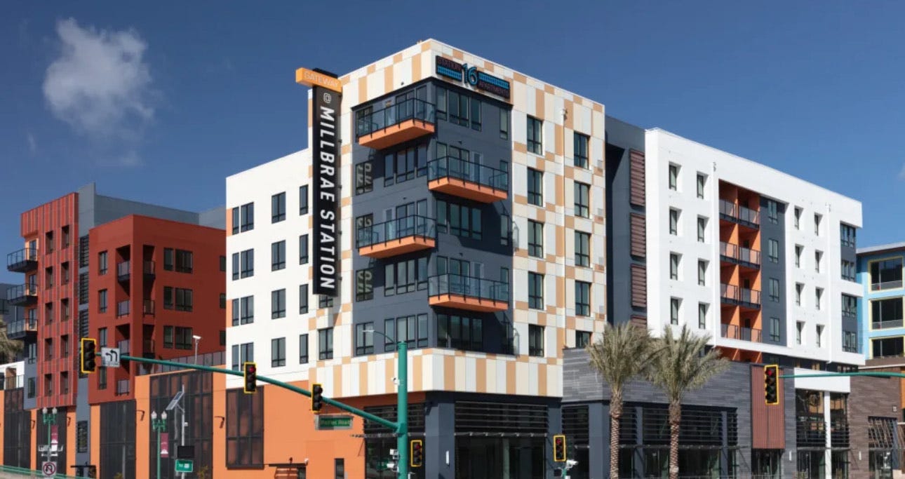
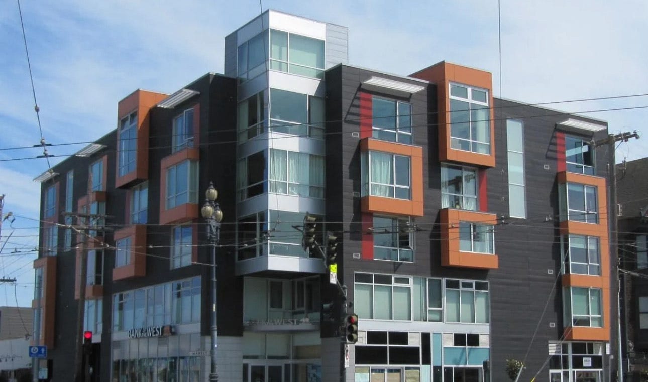
I shoot for no more than three (at most four) exterior materials on any project.
This approach ensures a cohesive design, avoiding the visual chaos that often accompanies the use of excessive elements and colors.
If you look at any of my buildings, you’ll typically see a combination of a few of the following materials on the facade: brick, stucco, Nichiha, Hardi Board, Pure & Preform, and metal panel.
Obviously, selecting the right materials involves balancing aesthetics, cost, and durability. For example, as much as you might love wood, you’d never use it in the Minnesota climate, or you’ll be repainting it in three years (and replacing it eventually). Nichiha allows for the warm appearance of wood without the associated upkeep.
Brick, stucco, metal panels. These are all durable materials that, when used thoughtfully, complement rather than compete with each other.
Beyond material selection, the design should incorporate features that enhance both the building's appearance and functionality. Articulation, or the creation of movement and depth in the facade, can transform a boring box into something that’s visually interesting.
Obviously, you need to make sure that the building’s articulation doesn't mess up any floor plans where those movements are made, but if you can do both, articulate and have grooves and movement in the building (and again, not screw up the floor plans!), that's excellent.
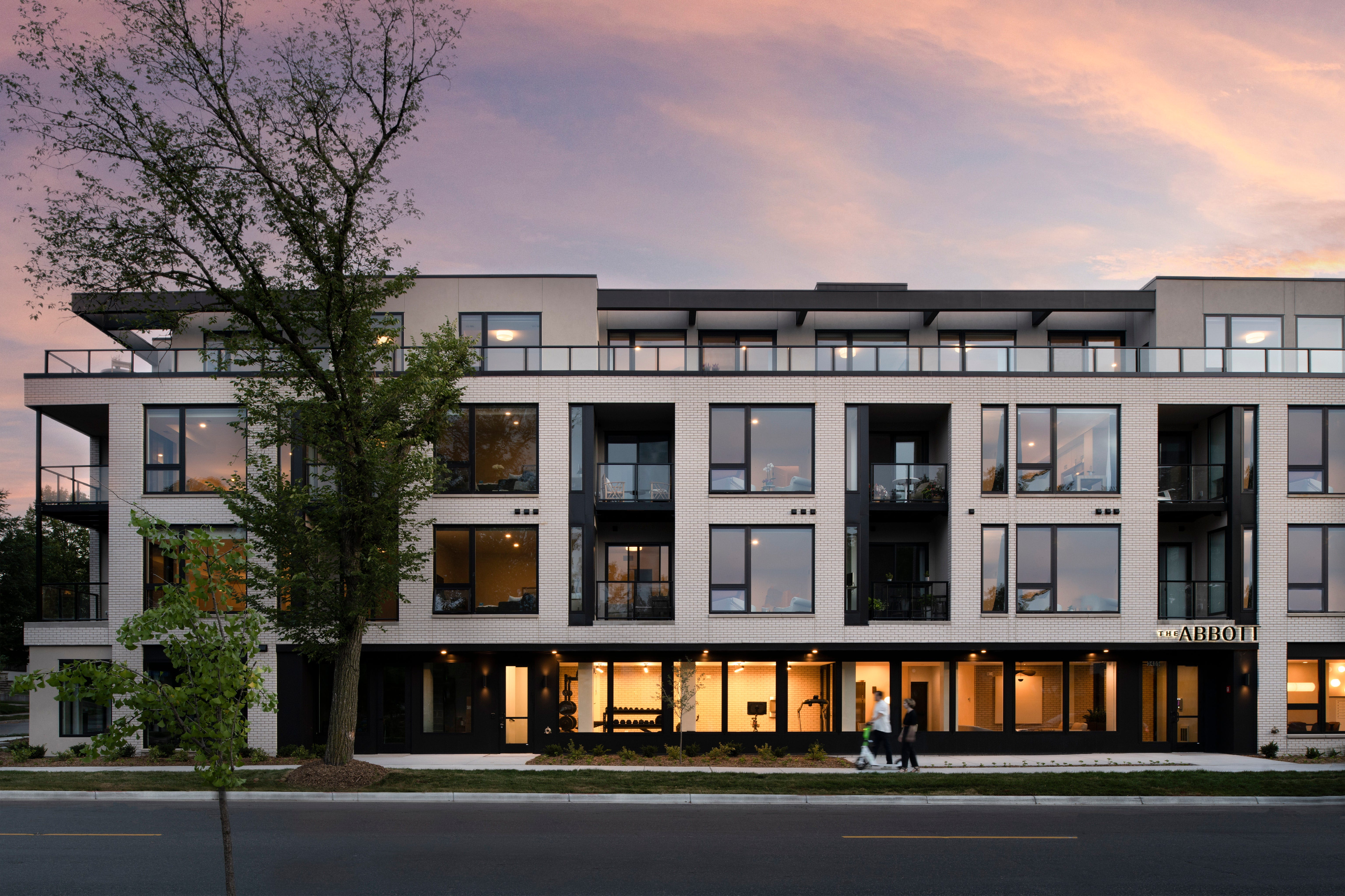
I also use setbacks on the top floor.
This accomplishes two things. First, it creates the opportunity for larger outdoor spaces. Second, it brings the overall building more in scale with the street. Visually, it makes the building seem less imposing against the backdrop of what are likely smaller structures.
And then, finally, even if we don’t have the budget to incorporate terraces into the design of the building, we always try to incorporate balconies, even small ones. Balconies give the tenant the opportunity to open a large window and get some fresh air, to step outside and absorb the neighborhood without necessarily being dropped straight into the hustle and bustle of the street. (One of my favorite spots when I lived in Chicago was on the couch, with a book, with the sliding door wide open.)
Okay, time for some visuals!

Notice how the setback on this project, Kolo, gives the illusion of a smaller scale. It appears to be a three-story building. The fact of the matter is that this is a four-story building next to a two-story building, and yet its scale plays nicely with the neighbors.
Balconies. Admittedly, these are generous balconies. Folks love them!
Pay attention to this part of the building. This is where all three different materials come together. They don’t look like they are crashing into each other though, but rather they complement each other. Partly, this has to do with the fact that their colors are muted, but during the day, there is a striking contrast between the brick and the Nichiha.
The other thing I want to point out is that developers and architects sometimes forget about that ever-present but unappreciated “material,” which is light. I know I’m stating the obvious here, but while windows let in light for tenants, they also let OUT light that washes across the facade of the building, which changes the feel of the building as the day shifts to night. Developers don’t pay sufficient attention to what their buildings look like at night, and you can see evidence of that in exteriors that scream with bright colors. During the day, of course, these bright colors and competing materials draw attention to the building. But at night, you want the pallet to be understated and simple so that it recedes into the background at first glance and instead emphasizes the living that is happening inside. There’s no better advertisement for your buildings than a bunch of people moving around against the soft glow of interior lights at night. It says: “We live here. We made a choice to live here.”
Peace,

Great stuff per normal, especially limiting the material palette. We’ve found that architects actually love having stricter guidelines like this as it allows them to be creative within a specific brief.
Also, we’ve had success with thermally modified wood on facades as it is real wood that has the moisture sucked out of it and can not rot. That or using something like cedar and black pine tar if you’re going for the jet black look. It also comes in a grey, some browns and barn red. That stuff will make a decent wood facade last forever…